Design: Difference between revisions
→T-Shirt design: links to artists |
|||
| Line 110: | Line 110: | ||
The design was done in Illustrator by Beta. The technique was to outline the entire original image using Illustrator's outlining capabilities, and then roughly 8-10 hours was spent making adjustments until it looked "right." | The design was done in Illustrator by Beta. The technique was to outline the entire original image using Illustrator's outlining capabilities, and then roughly 8-10 hours was spent making adjustments until it looked "right." | ||
Art by Nuriko Windchaser. | Art by [[Artists#Nuriko_Windchaser | Nuriko Windchaser]]. | ||
====2012==== | ====2012==== | ||
| Line 126: | Line 126: | ||
The design was done in Illustrator by Beta. A very deliberate design choice was made here for the gray-scale. It didn't pay off as this is the least popular shirt we have. Technique was similar to 2011, but as there was less detail in the art it didn't take as long. | The design was done in Illustrator by Beta. A very deliberate design choice was made here for the gray-scale. It didn't pay off as this is the least popular shirt we have. Technique was similar to 2011, but as there was less detail in the art it didn't take as long. | ||
Art by Nova. | Art by [[Artists#Nova|Nova]]. | ||
====2013==== | ====2013==== | ||
| Line 141: | Line 141: | ||
The design was done by Michelle Eaton with assistance from Rieev Princer. There was a possible version with a red "SNAFU" but because a 2-color design is cheaper to print, and the Red just popped way to much, the version with a white logo was used. Very, very, ''very'' minor changes were made by Beta before sending to print. | The design was done by Michelle Eaton with assistance from Rieev Princer. There was a possible version with a red "SNAFU" but because a 2-color design is cheaper to print, and the Red just popped way to much, the version with a white logo was used. Very, very, ''very'' minor changes were made by Beta before sending to print. | ||
Art by Rieev. | Art by [[Artists#Rieev|Rieev]]. | ||
====2014==== | ====2014==== | ||
[[File:2014-T-shirt--1.png|border|300px|2014 T-shirt design]] | [[File:2014-T-shirt--1.png|border|300px|2014 T-shirt design]] | ||
| Line 156: | Line 156: | ||
Rieev attempted a T-shirt design for 2014 but couldn't seem to make the lines clean enough for screen printing because her art style uses fades and fuzzes. The original design was scrapped and completely redone by Beta taking roughly 13 hours to complete. 2014 was the first shirt to use dots to shade and color areas of the shirt to effectively have a light-purple color and dark purple tones without adding more colors. This is also our first shirt on gray. | Rieev attempted a T-shirt design for 2014 but couldn't seem to make the lines clean enough for screen printing because her art style uses fades and fuzzes. The original design was scrapped and completely redone by Beta taking roughly 13 hours to complete. 2014 was the first shirt to use dots to shade and color areas of the shirt to effectively have a light-purple color and dark purple tones without adding more colors. This is also our first shirt on gray. | ||
Art by Rieev. | Art by [[Artists#Rieev|Rieev]]. | ||
===Con book cover=== | ===Con book cover=== | ||
Revision as of 10:35, 21 June 2015
Graphics Team
The graphics team is responsible for creating marketing material for con as well as badge designs and the con book. We take the submitted artwork and use it to create our designs.
Requirements
- Experience with Adobe Photoshop, Illustrator, and/or InDesign
- Accepting to critiques and changes to your work
- Have access to the internet and Dropbox
Responsibilities
- Create/Develop/Refine badge, fliers, and con book designs in a timely manner
- Review and suggest changes to other piece marketing material
- Make changes to work that is not yours and save it as another revision file
- Use submitted artwork in your design
- Save files to Drop Box (including work in progress)
File Sharing
All members of the graphics team must be shared on the 'snafucon art & graphics' Dropbox folder.
Inside the Dropbox graphics folder there is a text file which links to our Evernote graphics folder. All graphics and donated art are archived to Evernote. Any files too large for Evernote (over 100mb) are archived to an S3 bucket with a link in an Evernote note so that the larger files may still be accessed.
The Evernote and S3 bucket are shared publicly, so if you know the link you can access them. However, the link itself is not public and is only accessible to the graphics team through the Dropbox folder. At this time the files are not sensitive and thus do not need private sharing. However this can change at any time.
Naming Convention
Files which are modified by team members must include Rev and initials. This helps keep things straight in the file history.
Example:
- 2015_Flier_Rev_1_RP.psd
- 2015_Flier_Rev_2_SS.psd
- 2015_Flier_Rev_3_MD.psd
- 2015_Flier_Rev_4_SS.psd
- 2015_Flier_Rev_5_RP.psd
- 2015_Flier_Rev_6_MD.psd
Graphics Annual To Do List
Mascot for Website
Background for Website
Fliers
When designing use the file "BLANK 4x6 cmyk flier.psd" as a starting off point since it has been established at the right size with bleed and cropmarks. Make sure to hide the top layers when designing and periodically make them visible again so you can see your design and how it will look when printed. Your design must go all the way to the edges of the file!
Fliers are 4x6" with bleed.
It is generally best to use a previous year's design as a jumping off point (I like to copy relevant layers from the previous year into a new/blank flier)
We used to use both sides for text, but we after a tip from BLFC we tried just using the back for eye-catching art and got a better response on the fliers. If the back looks like something someone would pick up (or pay for) in artist alley, they're much more likely to want to take it off a flier table. Since we changed the style to this, we have people wanting to take the fliers just for the art - just like we hoped.
Note to the artist do not design the mascot to the size of this flier. We can not use 4"x6" art for the 11"x17" poster.
Required Specs
- Logo (Don't change the colors, just copy the layer from a previous flier)
- Year
- List of interesting items
- QR code
- URL
- Dates
- Location
- Theme
Poster fliers
11"x17"
Social Media
SEE THIS FOR SOCIAL MEDIA SIZES (2015 edition): Social Media Image Size Cheat Sheet
Social Media Icon
Twitter, Facebook and Tumblr can all use the same icon. It must be square. 2014's icon was 877x877 pixels, and 2015 was 765x765. It should generally be as large as possible and can just be a crop of the flier.
This is generally a closeup on the year's mascot's head (or a mascot if there are more than one).
Facebook header
Facebook header is 851x315. For 2015 I used this as a template, although a screenshot of facebook would also have worked as a template.
Facebook event header
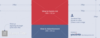
The event header for Facebook is different than the header for the Facebook page and needs to be specially designed for specific placement of items.
It would be best to look at last year's header file to start the current year. This is also a good place to start as it shows you the pixel sizes for things and what they're used for. It helps to use it as a layer in the file to reference and set guides and whatnot, as well.
Twitter header
There is a template in the dropbox for the 2015 header. It was downloaded from here.
Tumblr
I generally recycle the other SM images for Tumblr since all the services are similar.
Tumblr Header
In 2015 we used the same file as the Facebook Event page. Because it's size is 2/3rds the size of the event banner we can just move it to one side or the other and it seems to fit fine.
Tumblr Banner
I use the same banner as the Facebook Page banner. If I have time I will alter it so that the URL is not so high and move center content a little to the left. If in a rush - it's okay to use the Facebook banner with no changes.
Button/Pins design
T-Shirt design
The T-shirt design is usually a vector version of the main mascot for the year. T-shirts must be designed in illustrator with clean vector lines.
Whenever possible we need to go as few colors as possible. On dark shirts, one color will always be white as a base for other colors, so use white as one of the colors in the design if possible.
2011
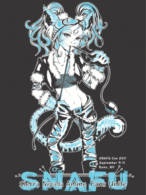
2-color design
Colors:
- White
- Cyan
Shirt Color: Black
The design was done in Illustrator by Beta. The technique was to outline the entire original image using Illustrator's outlining capabilities, and then roughly 8-10 hours was spent making adjustments until it looked "right."
Art by Nuriko Windchaser.
2012
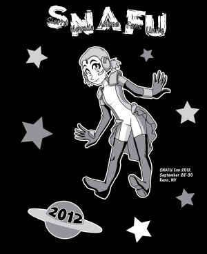
3-color design
Colors:
- White
- Light Gray
- Dark Gray
Shirt Color: Black
The design was done in Illustrator by Beta. A very deliberate design choice was made here for the gray-scale. It didn't pay off as this is the least popular shirt we have. Technique was similar to 2011, but as there was less detail in the art it didn't take as long.
Art by Nova.
2013
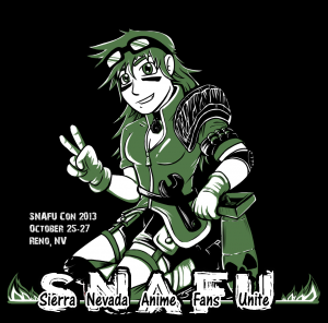
2-color design
Colors:
- White
- Green
Shirt Color: Black
The design was done by Michelle Eaton with assistance from Rieev Princer. There was a possible version with a red "SNAFU" but because a 2-color design is cheaper to print, and the Red just popped way to much, the version with a white logo was used. Very, very, very minor changes were made by Beta before sending to print.
Art by Rieev.
2014
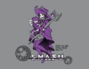
3-color design
Colors:
- White
- Purple
- Black
Shirt Color: Gray
Rieev attempted a T-shirt design for 2014 but couldn't seem to make the lines clean enough for screen printing because her art style uses fades and fuzzes. The original design was scrapped and completely redone by Beta taking roughly 13 hours to complete. 2014 was the first shirt to use dots to shade and color areas of the shirt to effectively have a light-purple color and dark purple tones without adding more colors. This is also our first shirt on gray.
Art by Rieev.
Con book cover
Con book layout
Badge Designs
General Attendee
General badges need to use the main con mascot for the year and match the general marketing materials used for the year.
Guest
We have never had a complaint over the guest badge design. It just needs to be different than the other designs. Guests are either being paid to be here or are here to market themselves - getting a cool badge is not one of their priorities (sometimes guests don’t even want to bother picking up their badge).
Vendor
Vendor badge designs seems to be more about us giving vendors something we want them to have than the vendors wanting something specific. The vendors don't seem to care about their badge design. They just want to get into their space and sell.
Artist
Artist badges need to be the prettiest, coolest, or 'artsy-est' of our badge designs.
Keep in mind, however, that no matter what badge design is given to the artists, there will always be artists who complain about their badges. Don’t take it personally - artists are impossible to please.
Staff
Staff badges need to be different than the general badges but still be cool looking. We’re the freaking staff and attendees should to want to be us. Our badges should be better than the general badges even though we probably will be getting a secondary mascot or completely different design.
Special Things
Staff badges get special randomness added to them so that the staff have an extra fun thing they get. Some staff do not care, but many of us love to look at each other’s badges and compare special items.
- 2011 Weakness and Status (not theme related)
- 2012 Weakness (In Space)
- 2013 Improvised Weapon (Apocalypse)
- 2014 Prepared Spell (Magic Theme)
Items are added to a large array and chosen at random. However, roughly 10% of the badges are rerun for various reasons. The most common reason was the random item came up too many times.
